Overview
The accordion layout is a simple collapsible accordion that uses the title of your item as the trigger to open or close the accordion. The accordion can use content from K2, Joomla or images populated from a directory.
The accordion layout is a simple collapsible accordion that uses the title of your item as the trigger to open or close the accordion. The accordion can use content from K2, Joomla or images populated from a directory.
There are two main types of carousels available in Zentools2:
The carousel below displays images from a folder using discs for pagination and the margin between items removed.


The carousel below displays images from a folder with the title overlaying the image.
The carousel below displays images from a folder where 3 items are always visible in the carousel above small screen widths. The title is displayed in a caption above the image when the user hovers over the image.
The following carousel displays each item in two columns. The carousel is set to only ever show a single item in the carousel at one time.
A livello epidemiologico, l’incidenza dell’autismo è stimata da 2 a 10 soggetti su 10.000, a seconda...
La sindrome di Asperger è un grave disturbo dello sviluppo caratterizzato da difficoltà nelle intera...
L’autismo è un disturbo molto complesso ed è pervasivo in quanto coinvolge molteplici aree di svilup...
Diversi studi (Schopler, Mesibov, Kunce, 1998) evidenziano che l'AS è molto più diffusa dell’autismo...
Il DSM-IV inserisce tra i criteri diagnostici un esordio prima dei tre anni, che si esprime con rita...
La diagnosi differenziale della Sindrome di Asperger richiede un’attenta valutazione, in modo da non...
"Il Filo dal Canestro diventa “Arte in Comune”, grazie al Dipartimento Politiche Sociali e Salute de...
La necessità di individuare i fattori causali dell’autismo, legata alla grande complessità e varietà...
Uno degli strumenti che consente di effettuare una diagnosi di Asperger è la “Scala Australiana dell...
Una delle ipotesi più recenti che potrebbe spiegare i meccanismi sottostanti i processi di imitazion...
La sindrome di Asperger, a differenza dell’autismo, pur non essendo caratterizzata, in modo tipico, ...
da oggi è presente in sede il Sistema HADO che consente di avere in sede ACQUA IDROGENATA e cioè arr...
Nell’ICD-10 (1995), corrispettivo europeo del DSM IV, vengono descritti “l’autismo atipico” e “la si...
Il DSM IV (1994) stabilisce, per l’attribuzione di una diagnosi di autismo, i seguenti criteri:
...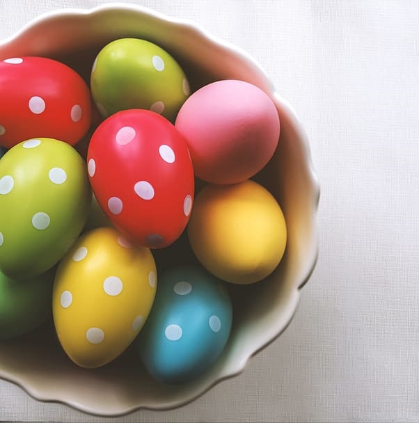
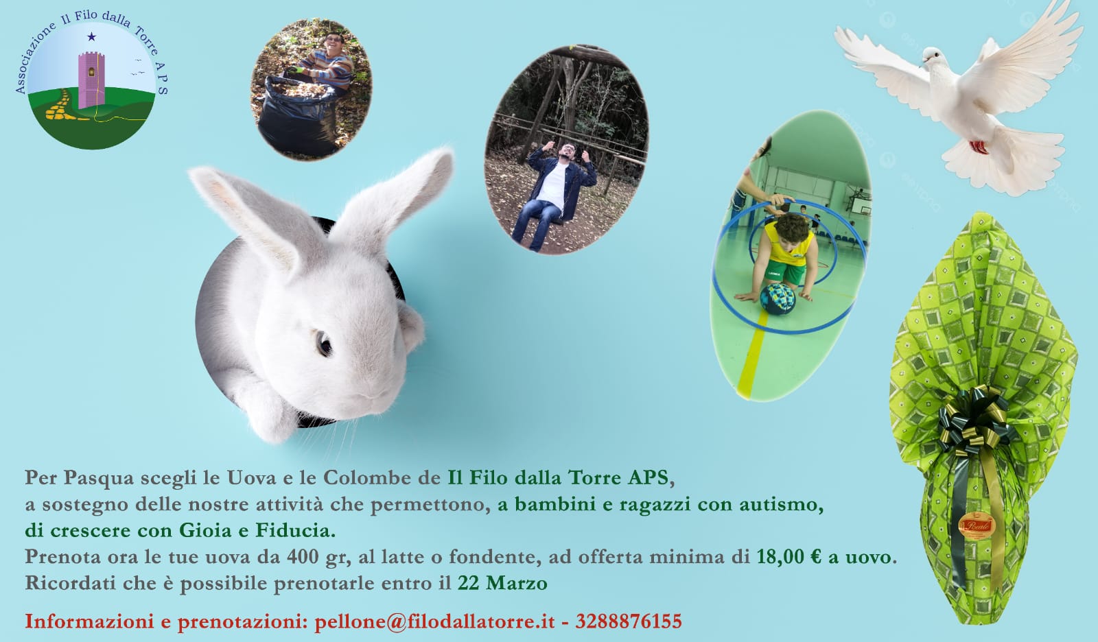
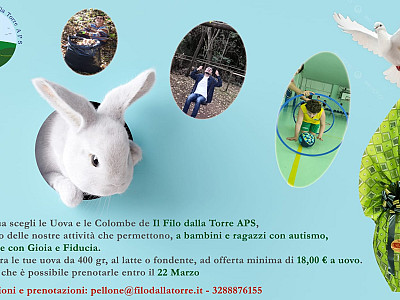
Per questa Pasqua regala un uovo solidale Il Filo dalla Torre e sosterrai le attività con le quali a...
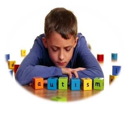
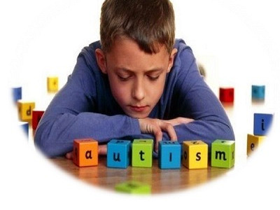
L'autismo rappresenta una delle più gravi manifestazioni che colpiscono il bambino, sin dai momenti ...
Alcuni giorni fa è giunta presso la sede dell' Associazione la vostra donazione, un meraviglioso al...
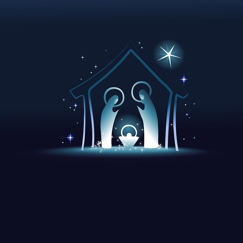
Il Natale è vicino e non sai cosa regalare? Cerchi un regalo originale e solidale?
Abbiamo la rispo...
L’idea di realizzare un progetto che trattasse il tema della sessualità all’interno del mondo dell’a...
Riprende nella Gioia il progetto Casa per le Autonomie.
Tra pochissimi giorni partiremo per i Soggiorni Estivi.
Condividiamo con voi l’avvio di un nuovo Progetto che l’Associazione Il Filo dalla Torre APS sta rea...
Domenica 14 e 21 Marzo 2021, avrà luogo il quinto incontro della Casa delle Autonomie, Il tema sarà ...
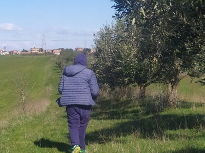
In questo periodo di emergenza Covid-19, continuano le nostre attività all’aperto, attività previste...
Il 2 Aprile si celebra, a livello internazionale, la Giornata Mondiale della Consapevolezza sull’Aut...


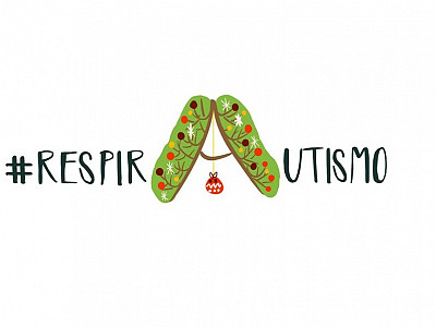
Ringraziamo di Cuore “Gruppo Spalato” per la Donazione, il cui ricavato sarà utilizzato esclusivamen...
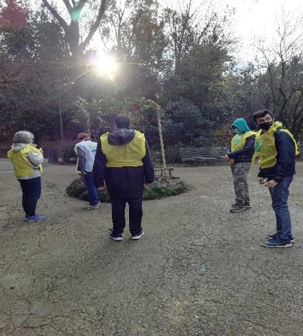
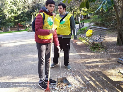
Sabato 19 Dicembre 2020, tre ragazzi dell’Associazione Il Filo dalla Torre APS, insieme al gruppo ...
Quest’anno, per Natale realizziamo insieme qualcosa di speciale ed importante.

Venerdì 18 Dicembre 2020, in occasione del Natale, nell’ambito del Progetto Centro Diurno Spazio Ins...

Domenica 11 e 18 Ottobre, si sono svolti in un clima di serenità i due primi incontri dell’anno dell...

L’Associazione Il Filo dalla Torre ONLUS, da oltre venti anni, si occupa della presa in carico globa...

The featured carousel displays 3 items in the carousel with the central item enlarged and at full opacity. The carousel reduces to one item per carousel on small screens. The numbered and disc pagination is not available with this layout.
A livello epidemiologico, l’incidenza dell’autismo è stimata da 2 a 10 soggetti su 10.000, a seconda...
La sindrome di Asperger è un grave disturbo dello sviluppo caratterizzato da difficoltà nelle intera...

L’autismo è un disturbo molto complesso ed è pervasivo in quanto coinvolge molteplici aree di svilup...
Diversi studi (Schopler, Mesibov, Kunce, 1998) evidenziano che l'AS è molto più diffusa dell’autismo...
Il DSM-IV inserisce tra i criteri diagnostici un esordio prima dei tre anni, che si esprime con rita...
La diagnosi differenziale della Sindrome di Asperger richiede un’attenta valutazione, in modo da non...
"Il Filo dal Canestro diventa “Arte in Comune”, grazie al Dipartimento Politiche Sociali e Salute de...
La necessità di individuare i fattori causali dell’autismo, legata alla grande complessità e varietà...
Uno degli strumenti che consente di effettuare una diagnosi di Asperger è la “Scala Australiana dell...

Una delle ipotesi più recenti che potrebbe spiegare i meccanismi sottostanti i processi di imitazion...
La sindrome di Asperger, a differenza dell’autismo, pur non essendo caratterizzata, in modo tipico, ...
da oggi è presente in sede il Sistema HADO che consente di avere in sede ACQUA IDROGENATA e cioè arr...
Nell’ICD-10 (1995), corrispettivo europeo del DSM IV, vengono descritti “l’autismo atipico” e “la si...
Il DSM IV (1994) stabilisce, per l’attribuzione di una diagnosi di autismo, i seguenti criteri:
...
Per questa Pasqua regala un uovo solidale Il Filo dalla Torre e sosterrai le attività con le quali a...
L'autismo rappresenta una delle più gravi manifestazioni che colpiscono il bambino, sin dai momenti ...
Alcuni giorni fa è giunta presso la sede dell' Associazione la vostra donazione, un meraviglioso al...
Il Natale è vicino e non sai cosa regalare? Cerchi un regalo originale e solidale?
Abbiamo la rispo...
L’idea di realizzare un progetto che trattasse il tema della sessualità all’interno del mondo dell’a...
Riprende nella Gioia il progetto Casa per le Autonomie.
Tra pochissimi giorni partiremo per i Soggiorni Estivi.
Condividiamo con voi l’avvio di un nuovo Progetto che l’Associazione Il Filo dalla Torre APS sta rea...
Domenica 14 e 21 Marzo 2021, avrà luogo il quinto incontro della Casa delle Autonomie, Il tema sarà ...
In questo periodo di emergenza Covid-19, continuano le nostre attività all’aperto, attività previste...
Il 2 Aprile si celebra, a livello internazionale, la Giornata Mondiale della Consapevolezza sull’Aut...
Ringraziamo di Cuore “Gruppo Spalato” per la Donazione, il cui ricavato sarà utilizzato esclusivamen...
Sabato 19 Dicembre 2020, tre ragazzi dell’Associazione Il Filo dalla Torre APS, insieme al gruppo ...
Quest’anno, per Natale realizziamo insieme qualcosa di speciale ed importante.
Venerdì 18 Dicembre 2020, in occasione del Natale, nell’ambito del Progetto Centro Diurno Spazio Ins...
Domenica 11 e 18 Ottobre, si sono svolti in un clima di serenità i due primi incontri dell’anno dell...
L’Associazione Il Filo dalla Torre ONLUS, da oltre venti anni, si occupa della presa in carico globa...
The carousel below displays images from a folder using the Featured layout.
The carousel below displays images from a folder using the boxed layout which adds a container element around the items in the carousel that appear after the first item. The carousel also has the equal heights option enabled which ensures all items in the carousel have the same height.
The carousel below displays images from a folder using the animated overlay theme. This means that when the user hovers over each item the item title or any other items in the layout are animated onto the page.
As the user scrolls down the page the images remain fixed in place and are covere dup by the following images.
The slideshow below displays the image, title and content of items in a slideshow using the fadeUp transition. Next and previous buttons are enabled for navigation between items.
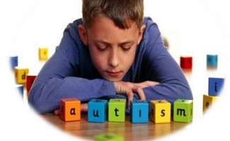
Considerato una delle sindromi più complesse e difficilmente gestibili dell’età evolutiva, il Disturbo dello Spettro Autistico viene definito dalla comunità scientifica internazionale come un disturbo pervasivo dello sviluppo
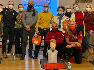
UNA RISPOSTA EMPATICA E PRFESSIONALE ALLA PREOCCUPAZIONE DEI GENITORI
Gli incontri, dopo una valutazione specifica, hanno come obiettivo quello di favorire l’acquisizione di competenze occupazionali: lavorare in autonomia, lavorare in una catena di montaggio,
Tra pochissimi giorni partiremo per i Soggiorni Estivi.
L’idea di realizzare un progetto che trattasse il tema della sessualità all’interno del mondo dell’autismo nasce dalla considerazione che la sfera della sessualità, e più in generale dell’affettività, non solo possa far parte della disabilità ma sia parte integrante di essa.

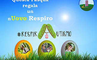
Ringraziamo di Cuore “Gruppo Spalato” per la Donazione, il cui ricavato sarà utilizzato esclusivamente per le attività di #RespirAutismo!
Domenica 14 e 21 Marzo 2021, avrà luogo il quinto incontro della Casa delle Autonomie, Il tema sarà “Il Cambiamento”.
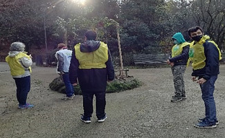
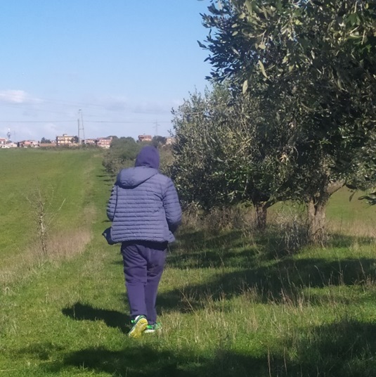
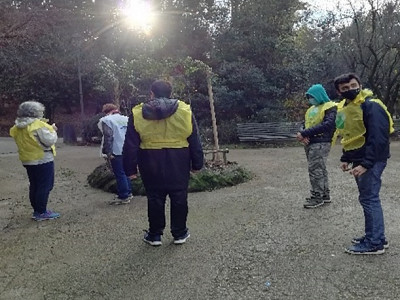
In questo periodo di emergenza Covid-19, continuano le nostre attività all’aperto, attività previste nel Progetto Pulizia Parchi e in sinergia con il Progetto #RespirAutismo!
Il Parent Training è uno dei contesti di intervento dell’approccio integrato nell’autismo, che consente di fornire un sostegno importante alle famiglie
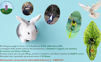
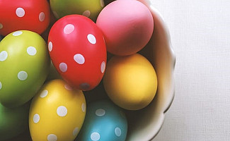
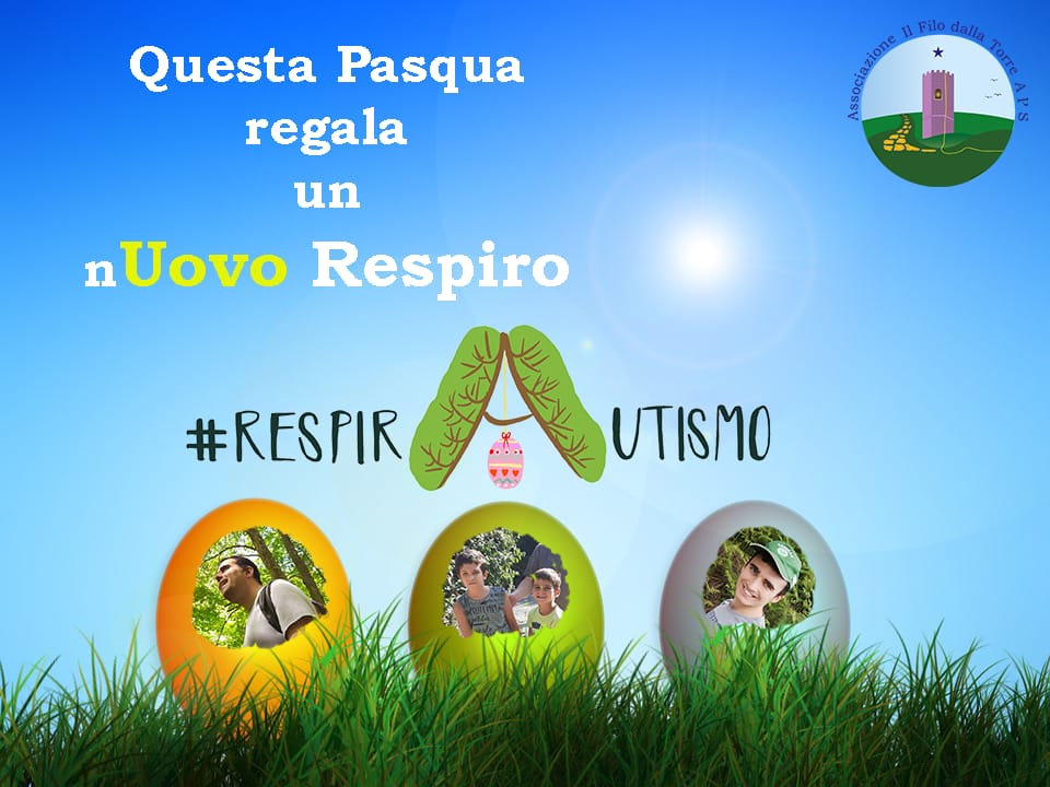
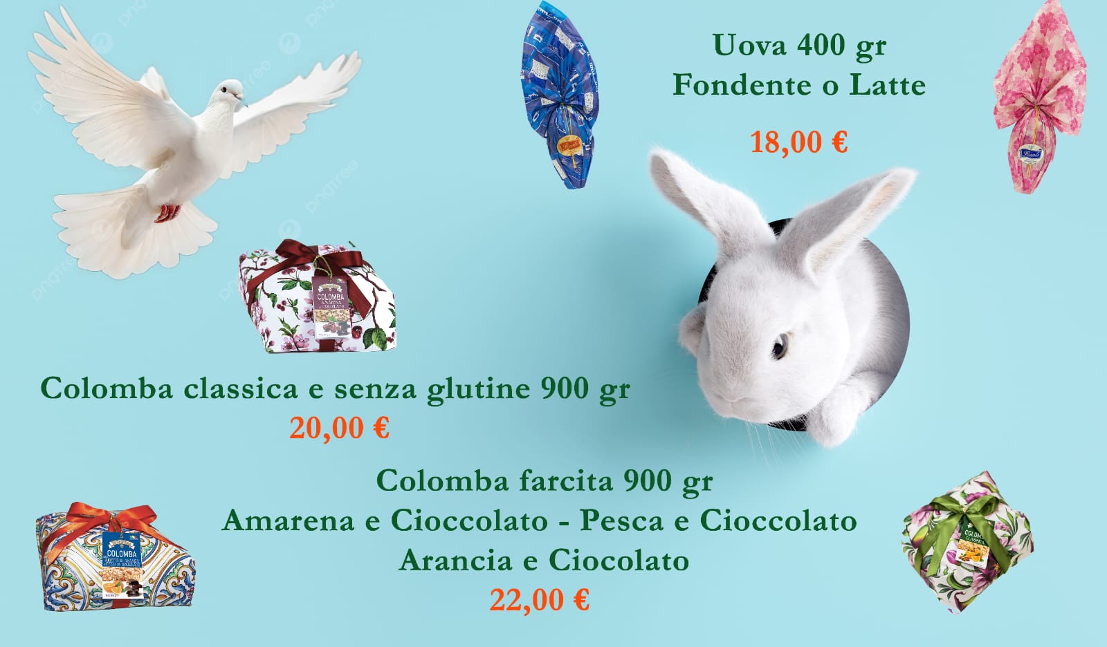
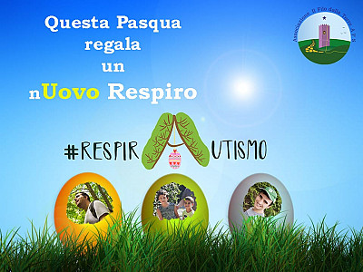
Per questa Pasqua regala un uovo solidale Il Filo dalla Torre e sosterrai le attività con le quali accompagniamo bambini e ragazzi con autismo a crescere, creando insieme il loro futuro.
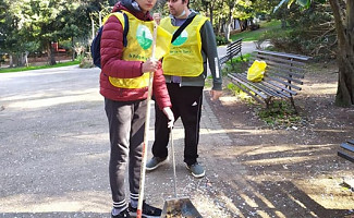
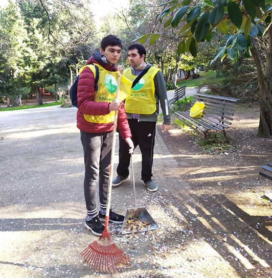
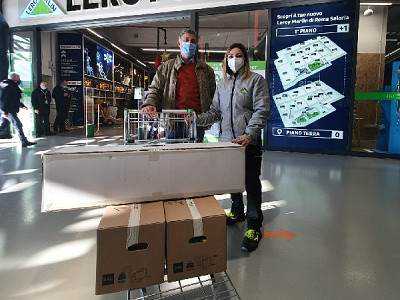
Sabato 19 Dicembre 2020, tre ragazzi dell’Associazione Il Filo dalla Torre APS, insieme al gruppo dei volontari “Amici di Villa Leopardi” e agli operatori, hanno realizzato la prima uscita dell’anno del Progetto Pulizia dei Parchi.
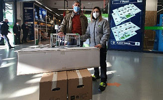
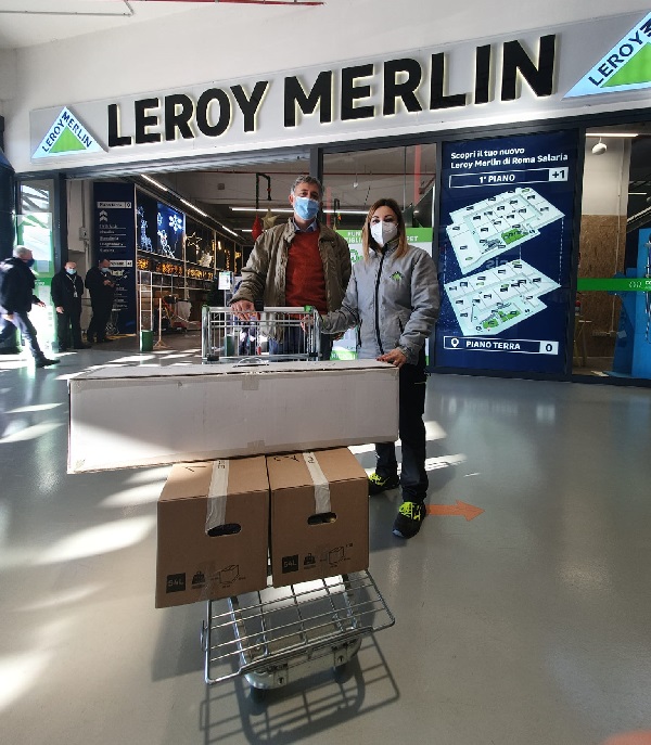
Alcuni giorni fa è giunta presso la sede dell' Associazione la vostra donazione, un meraviglioso albero di Natale con le sue decorazioni.
L’autismo è un disturbo molto complesso ed è pervasivo in quanto coinvolge molteplici aree di sviluppo. Le aree maggiormente interessate sono: l’area psicomotoria, l’area cognitiva, l’era comunicativa e linguistica ed infine l’area emotiva e sociale.
La necessità di individuare i fattori causali dell’autismo, legata alla grande complessità e varietà dei sintomi con cui si manifesta, ha portato nel corso degli anni all’elaborazione di modelli interpretativi, spesso, molto contrastanti tra loro.
Realizzati da un consulente psicologo, l’intervento sulla consapevolezza di sé è rivolto ai ragazzi dai 14 anni che iniziano ad affacciarsi all’adolescenza.
Uno degli strumenti che consente di effettuare una diagnosi di Asperger è la “Scala Australiana della Sindrome D'asperger” (Garnett, Attwood, 1994),
Una delle ipotesi più recenti che potrebbe spiegare i meccanismi sottostanti i processi di imitazione, empatia, e mostrare quali sono le basi neuronali implicate nell’autismo viene dalle neuroscienze: la scoperta dei “neuroni a specchio” (mirror neurons).
Nell’ICD-10 (1995), corrispettivo europeo del DSM IV, vengono descritti “l’autismo atipico” e “la sindrome disintegrativa dell’infanzia non altrimenti specificata”.
Il DSM IV (1994) stabilisce, per l’attribuzione di una diagnosi di autismo, i seguenti criteri:
Il DSM-IV inserisce tra i criteri diagnostici un esordio prima dei tre anni, che si esprime con ritardi o anomalie nelle aree dell’interazione sociale e/o della comunicazione e/o del gioco simbolico(APA, 2002).
L’Intervento Abilitativo Domiciliare, come quello scolastico, ha l'obiettivo di favorire un’integrazione ed un’omogeneità del lavoro svolto nei contesti di Parent Training ed ambulatoriale,

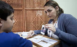
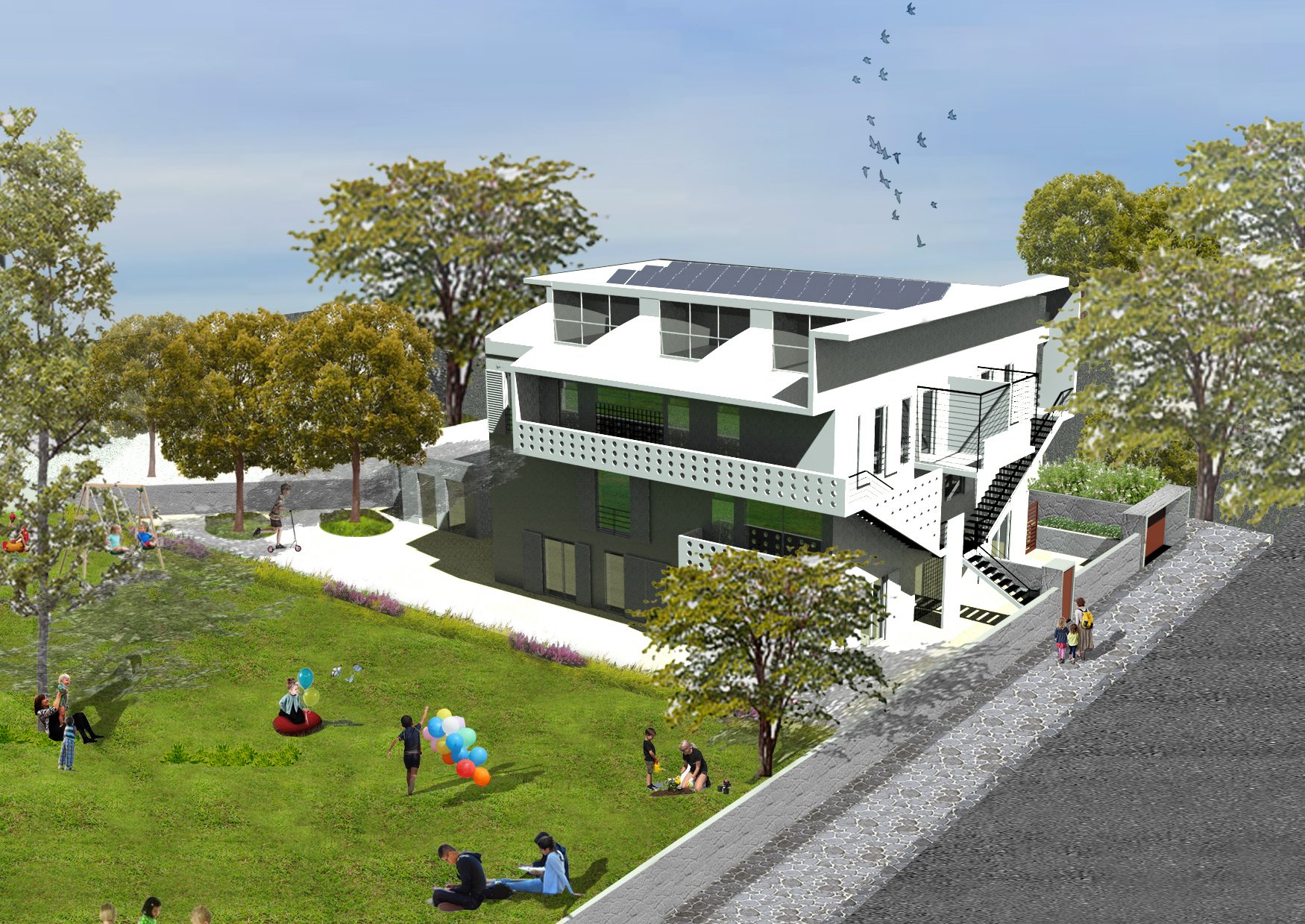
L’Associazione Il Filo dalla Torre ONLUS, da oltre venti anni, si occupa della presa in carico globale di bambini e ragazzi con Disturbo dello Spettro Autistico, delle loro famiglie e di tutti i contesti di crescita, grazie alla collaborazione di psicologi, psicoterapeuti ed educatori.
Condividiamo con voi l’avvio di un nuovo Progetto che l’Associazione Il Filo dalla Torre APS sta realizzando insieme a MEA (Massenzio Etica ed Autismo), grazie a dei finanziamenti europei, per la realizzazione di buone prassi per l’inclusione delle persone con Disturbo dello Spettro Autistico, nel mondo del lavoro.

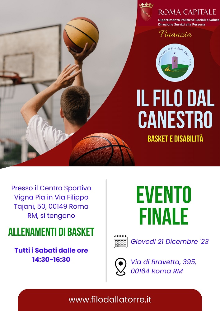
"Il Filo dal Canestro diventa “Arte in Comune”, grazie al Dipartimento Politiche Sociali e Salute del Comune di Roma che ha scelto di finanziare per i mesi di novembre e dicembre il nostro progetto.
Lo Scopo del Comune di Roma è quello di ampliare i servizi e gli interventi oggi già presenti rivolti alle persone con disabilità o con disagio psichico prevedendo un arricchimento dell’offerta negli ambiti dello sport, della cultura e della musica, nella convinzione che ciò favorisca i processi di inclusione e di conseguenza aumenti la qualità di vita di chi parteciperà alle attività.
Le iscrizioni sono ancora aperte, vieni anche tu a giocare con noi e prenota un allenamento di prova.
Per info e prenotazione: 3355778869"
Domenica 11 e 18 Ottobre, si sono svolti in un clima di serenità i due primi incontri dell’anno della Casa per le Autonomie.
da oggi è presente in sede il Sistema HADO che consente di avere in sede ACQUA IDROGENATA e cioè arricchita con IDROGENO MOLECOLARE. Questo rappresenta la maniera più comoda per assumere l’idrogeno molecolare e godere dei suoi benefici.
Il 2 Aprile si celebra, a livello internazionale, la Giornata Mondiale della Consapevolezza sull’Autismo, promossa dall’Assemblea Generale delle Nazioni Unite, per sensibilizzare l’opinione pubblica e la comunità scientifica sui disturbi dello spettro autistico.

Venerdì 18 Dicembre 2020, in occasione del Natale, nell’ambito del Progetto Centro Diurno Spazio Insieme, verrà realizzata la Festa “Connessi al Cuore”
Diversi studi (Schopler, Mesibov, Kunce, 1998) evidenziano che l'AS è molto più diffusa dell’autismo classico: infatti, mentre al prevalenza dell’autismo è di circa 4 su 10000 bambini, si stima che la AS raggiunga punte di 20- 25 su 10000.
A livello epidemiologico, l’incidenza dell’autismo è stimata da 2 a 10 soggetti su 10.000, a seconda dei criteri diagnostici usati: in Europa la percentuale di incidenza risulta tra 2 e 4 individui su 10.000 (Borghese, Porcaro, 2000).
La diagnosi differenziale della Sindrome di Asperger richiede un’attenta valutazione, in modo da non confondere questo disturbo, con altri, che hanno degli aspetti in comune.
La sindrome di Asperger è un grave disturbo dello sviluppo caratterizzato da difficoltà nelle interazioni sociali, e da insoliti e ristretti pattern di comportamento e di interessi.
Dal 1997, l’Associazione Il Filo dalla Torre collabora con la ASL RM 2 (sia per quanto concerne il territorio della ex RM C che della ex RM B), mediante l’erogazione di progetti, che prevedono la realizzazione di interventi abilitativi, a favore di numerose famiglie con minori con autismo.
L’approccio integrato nell’autismo prevede la realizzazione di un lavoro svolto nelle sedute familiari, che diventa fondamentale nel sostenere lo sviluppo di ogni membro della famiglia e, quindi, del bambino con handicap:

Quest’anno, per Natale realizziamo insieme qualcosa di speciale ed importante.
Riprende nella Gioia il progetto Casa per le Autonomie.
La sindrome di Asperger, a differenza dell’autismo, pur non essendo caratterizzata, in modo tipico, dalla presenza di anomalie significative nella comunicazione, mostra alcuni aspetti nelle capacità comunicative di interesse clinico.
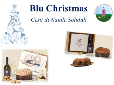
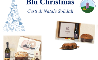
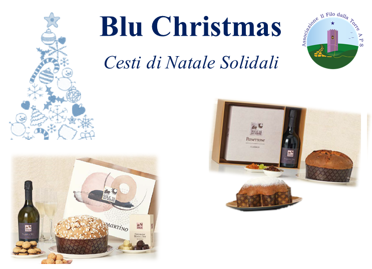
Il Natale è vicino e non sai cosa regalare? Cerchi un regalo originale e solidale?
Abbiamo la risposta: BluChristmas, il cesto solidale con prodotti di alta qualità!
L'autismo rappresenta una delle più gravi manifestazioni che colpiscono il bambino, sin dai momenti più precoci del suo sviluppo, nella sua capacità di stabilire interazioni con il mondo esterno e quindi di interessarsi, comprendere e partecipare attivamente alle relazioni sociali con atteggiamenti di isolamento e chiusura agli stimoli interpersonali.

L’intervento sulla comunicazione è rivolto a tutti i bambini o ragazzi autistici che non hanno ancora sviluppato un codice comunicativo condiviso
Il Servizio Ambulatoriale offre un intervento abilitativo altamente specializzato e specifico per ogni bambino o ragazzo, in base alle sue esigenze, alla sua età e alle sue necessità.
La Riabilitazione Neuropsicomotoria ha l’obiettivo di favorire lo sviluppo motorio, cognitivo e comunicativo – relazionale del bambino, stimolandone le potenzialità
Le abilità cognitive sono quelle capacità che ci permettono una corretta interpretazione ed integrazione della realtà, che coordinano le nostre conoscenze e favoriscono l’acquisizione di maggiori capacità adattive.
It is possible to create a slideshow that uses embedded video from vimeo or youtube. The video iframes are taken from the intortext of your Joomla content or from the K2 video item. Please note that the video stops once the slide progresses to the next slide in the slideshow and so it is advised that you disable autoplay if using video in your slideshow.
The backstretch slideshow is ideal for slideshows that need to retain the same height across multiple device widths. The bvackstretch library centers the image and resizes the height or width to retain the aspect ratio as much as possible.


The slideshow below highlights the use of thumbnails to trigger the slideshow. The thumbnails are a linked carousel that scrolls through the available items in the slideshow. You can specify the number of thumbs to display across a variety of screen sizes. The thumbs displayed below the slideshow are displayed in a carousel that automatically scrolls so that the active item is shown in the carousel. The slideshow settings allow you to determine the number of thumbs that should be shown across large, medium and small screen sizes.


The slideshow below uses the animated overlay half theme option. All items other than the image are displayed in the overlay which animates onto the screen a short time after the slideshow image is tansitioned.
The slideshow below uses the same settings as the exampel above except in this case it uses the animated overlay half style.
The full slideshow overlay places an overlay over the entire image. The content of the slideshow is then displayed above the image.
The boxed layout adds a box underneath the items in the slideshow except for the slideshow image.
Theme
The theme applied to the slideshow. Includes none, boxed, overlay, overlay half, overlay full, animate overlay and animated overlay half.
Effect
Effect applied to the slide as it moves from one item to the next. Includes: fade, backslide, go down, fade up and slide.
Autoplay
When enabled the slideshow automatically transitions to the next slide.
Autoplay Speed
The time between slides when slideshow is autoplaying.
Autoheight
When enabled the slideshow adjusts it's height to match the height of each item in the slideshow.
Slideshow Counter
Displays a counter that shows the number of the current slide and the total of all of the slides in the slideshow.
Navigation Arrows
When enabled next and previous buttons are used to navigate to the next and previous items in the slideshow.
Previous Text
Text used for button that moves the slideshow to previous item
Next Text
Text used for button that moves the slideshow to next item
Pagination Type
The type of pagination to be used to trigger the display of individual items.Options: None, discs, numbers, thumbs.
Large screen width
Items to show in the pagination area on large screens
Items to show on large screen
Items to show in the pagination area on large screens
Medium screen Width
Items to show in the pagination area on medium screens
Items to show on medium width
Items to show in the pagination area on medium screens
Small screen width
The px width (without px value) that small screen thumbs are used.
Items to show on small screen
Items to show in the pagination area on small screens
Thumbnail width
The width of thumbnails in the navigation
Thumbnail height
The width of thumbnails in the pagination.
Clicking on the image below will launch the zentools2 lightbox which contains another 4 images included in the gallery.
This means that at it's widest point the grid will only be displayed in 1,2,3,4,5 or 6 columns. At screen widths larger than the desktop breakpoint the module will always display the maximum number of columns. At sizes smaller than the desktop valkue the grid will display in fewer columns that make your content more readable.
An example
For instance if you set the large screen value to 1200px, medium screen value to 800px and the small screen value to 600px and the maximum column option to 4, when the browser is above 1200px the module will always display it's items in 4 columns.
On screens smaller than the desktop width the module will revert to 3 columns (in between 800px and 1200px) for medium screen sizes and 2 columns for screens larger than small screens and smaller than medium screens (600px to 800px). And for screens smaller than the small screen width (600px) the module will collapse to a single column layout.
Custom Screensizes
The module allows you to determine the value assigned to each screen size on a module per module basis or for all instances of the Zentools module, giving you complete control over how how your content displays in your template across a range of screensizes.
The Grid below is set to display in a maximum of 4 columns. The settings in the module determine the points at which the grid resolves to 3,2 and 1 column.
The Grid below is set to display in a maximum of 2 columns. The settings in the module determine the points at which the grid resolves to 3,2 and 1 column.


The Grid below is set to display in a maximum of 2 columns. The settings in the module determine the points at which the grid resolves to 3,2 and 1 column.
The Grid below is set to display in a maximum of 2 columns. The settings in the module determine the points at which the grid resolves to 3,2 and 1 column.

The grid below is displaying a maximum of 3 column grids, with no margins and the title element overlaying the image.
The grid below is displaying a maximum of 3 column grids, with no margins and the title element transitions into view when the user hovers over the image.
The grid below uses the boxed theme and the setting to make the items equal height enabled. The equal height settings ensures that your grid of items maintains a uniform and consistent display.
The grid below uses the boxed theme and the setting to make the items equal height disabled.
The grid below uses the setting called Enable grid on small screens to ensure that the grid items do not collapse when viewed on a small screen.

Themes
The grid layout also includes a number of different theme options. They include:
Display options
Other display options include:
Effects
The grid layout also has the option to provide an animated effect for when the item is visible on the screen. When this option is enabled and if the item is visible on the screen on page load or becomes visible on the page as the user scrolls the item is transitioned onto the page.
The available effects include:

Each item in each group can be displayed in single or multiple column layouts.
News (30)
Autismo (8)
Asperger (5)
The grouped option is ideal for displaying your content in a table of contents or site map type of layout. The module provides the option to hide or show the button at the bottom of each column, as well as specifying the text used and the class / style applied to it. The options for thje class include none, simple and btn - which inheirts your template's button style.
Servizi sanitari (5)
News (30)
Autismo (8)
Asperger (5)
Maximum number of columns.
This option determines the number of columns to group each category of items in. Columns within each group are defined int he layout tool.
Theme
None, boxed, overlay, animated overlay
Remove margin between items
Removes the gutter between each item so that the columns sit next to eachother.
Link to more items
When enabled a link is added to the bottom of each column that provides a link to the corresponding category. This option is not available for the images and gallery content source.
Link to more items button style
This option allows the user to specify a class / style to apply to the link to more text button. There are three options:
Text for link to more items
This allows the user to define the text used for the more items link.
Display item count
Displays the number of items being displayed for each column at the top of each column.
Display item category
Displays the category for each column at the top of the column.
Hide items until images have loaded
Acts as a preloader that hides the content of the moduel until all of the images in that module have loaded
Display loading animation
Option to display a loading animation while the images are loaded in the background.
Loading Message
The text used to display while the images are loading. Leave blank to avoid showing any message.
The filter layout is a grid based layout that allows the user to filter the items that are shown in the module according to their respective categories. The triggers are automatically populated based on the category of your item.
Masonry layouts are typically vertical grids rather than horizontal grids which means that the script will try to place the items evenly across the page rather than evenly down the page.
The example below shows a masonry layout using the default settings. The middle larger image is a featured item and takes approximately twice as much space in the layout as the non featured items.
This style adds a static overlay to all items in the layout.
This style adds an animated overlay ot the item when the user hovers over any item in the layout.
The overlay on featured items only option adds the title, text or any other elements specified in the item layout with an overlay effect only to featured items. Any non featured items are displayed as an image only.
The masonry example below uses the built in boxed styling that can be applied to most of the Zentools layouts. The boxed styling targets all items other than the first item (in this case all items except for the image) and places in a padded box. The color of the box is easily specified in the module settings.
Considerato una delle sindromi più complesse e difficilmente gestibili dell’età evolutiva, il Distur...
UNA RISPOSTA EMPATICA E PRFESSIONALE ALLA PREOCCUPAZIONE DEI GENITORI
Gli incontri, dopo una valutazione specifica, hanno come obiettivo quello di favorire l’acquisizione...
Tra pochissimi giorni partiremo per i Soggiorni Estivi.
L’idea di realizzare un progetto che trattasse il tema della sessualità all’interno del mondo dell’a...
Ringraziamo di Cuore “Gruppo Spalato” per la Donazione, il cui ricavato sarà utilizzato esclusivamen...
Domenica 14 e 21 Marzo 2021, avrà luogo il quinto incontro della Casa delle Autonomie, Il tema sarà ...
In questo periodo di emergenza Covid-19, continuano le nostre attività all’aperto, attività previste...
Il Parent Training è uno dei contesti di intervento dell’approccio integrato nell’autismo, che conse...
Per questa Pasqua regala un uovo solidale Il Filo dalla Torre e sosterrai le attività con le quali a...
Sabato 19 Dicembre 2020, tre ragazzi dell’Associazione Il Filo dalla Torre APS, insieme al gruppo ...
Alcuni giorni fa è giunta presso la sede dell' Associazione la vostra donazione, un meraviglioso al...
L’autismo è un disturbo molto complesso ed è pervasivo in quanto coinvolge molteplici aree di svilup...
La necessità di individuare i fattori causali dell’autismo, legata alla grande complessità e varietà...
Realizzati da un consulente psicologo, l’intervento sulla consapevolezza di sé è rivolto ai ragazzi ...
Uno degli strumenti che consente di effettuare una diagnosi di Asperger è la “Scala Australiana dell...
Una delle ipotesi più recenti che potrebbe spiegare i meccanismi sottostanti i processi di imitazion...
Nell’ICD-10 (1995), corrispettivo europeo del DSM IV, vengono descritti “l’autismo atipico” e “la si...
Il DSM IV (1994) stabilisce, per l’attribuzione di una diagnosi di autismo, i seguenti criteri:
...Il DSM-IV inserisce tra i criteri diagnostici un esordio prima dei tre anni, che si esprime con rita...
L’Intervento Abilitativo Domiciliare, come quello scolastico, ha l'obiettivo di favorire un’integraz...
L’Associazione Il Filo dalla Torre ONLUS, da oltre venti anni, si occupa della presa in carico globa...
Condividiamo con voi l’avvio di un nuovo Progetto che l’Associazione Il Filo dalla Torre APS sta rea...
"Il Filo dal Canestro diventa “Arte in Comune”, grazie al Dipartimento Politiche Sociali e Salute de...
Domenica 11 e 18 Ottobre, si sono svolti in un clima di serenità i due primi incontri dell’anno dell...
da oggi è presente in sede il Sistema HADO che consente di avere in sede ACQUA IDROGENATA e cioè arr...
Il 2 Aprile si celebra, a livello internazionale, la Giornata Mondiale della Consapevolezza sull’Aut...
Venerdì 18 Dicembre 2020, in occasione del Natale, nell’ambito del Progetto Centro Diurno Spazio Ins...
Diversi studi (Schopler, Mesibov, Kunce, 1998) evidenziano che l'AS è molto più diffusa dell’autismo...
A livello epidemiologico, l’incidenza dell’autismo è stimata da 2 a 10 soggetti su 10.000, a seconda...
La diagnosi differenziale della Sindrome di Asperger richiede un’attenta valutazione, in modo da non...
La sindrome di Asperger è un grave disturbo dello sviluppo caratterizzato da difficoltà nelle intera...
Dal 1997, l’Associazione Il Filo dalla Torre collabora con la ASL RM 2 (sia per quanto concerne il t...
L’approccio integrato nell’autismo prevede la realizzazione di un lavoro svolto nelle sedute familia...
Quest’anno, per Natale realizziamo insieme qualcosa di speciale ed importante.
Riprende nella Gioia il progetto Casa per le Autonomie.
La sindrome di Asperger, a differenza dell’autismo, pur non essendo caratterizzata, in modo tipico, ...
Il Natale è vicino e non sai cosa regalare? Cerchi un regalo originale e solidale?
Abbiamo la rispo...
L'autismo rappresenta una delle più gravi manifestazioni che colpiscono il bambino, sin dai momenti ...
L’intervento sulla comunicazione è rivolto a tutti i bambini o ragazzi autistici che non hanno ancor...
Il Servizio Ambulatoriale offre un intervento abilitativo altamente specializzato e specifico per og...
La Riabilitazione Neuropsicomotoria ha l’obiettivo di favorire lo sviluppo motorio, cognitivo e comu...
Le abilità cognitive sono quelle capacità che ci permettono una corretta interpretazione ed integraz...
This is an example of the masonry layout using custom values for the widths of the standard and featured items. In this case standard items have a width of 12% and featured items have a width of 25%. Custom widths are easily created by creating custom settings in the module parameters.
The Zentools2 module provides a lot of control when it comes to rendering masonry layouts. It's important to note that you may experience inconsistent results depending on the values you supply for item widths and gutters.
The demo above (other than the small example) use the following width values:
The following options can be found in the options panel in the module settings.
none / boxed / overlay / Featured Overlay / Animated Overlay
off / on
The following options can be found in the theme panel in the module settings
This setting specifies the browser width at which all items are given 100% width.
This setting specifies the width of non-featured items in the layout. Use px or % values.
This setting specifies the width of the featured items in the layout. Use px or %.
This setting specifies the gutter between items in the layout. Use px or %.
This item specifies the margin below items in the layout. Use px.
Via di Bravetta 395 - 00164 - Roma
Tel/Fax: 0666165072
Cell: 3355778869
Email: info@filodallatorre.it.